Lone Star UI
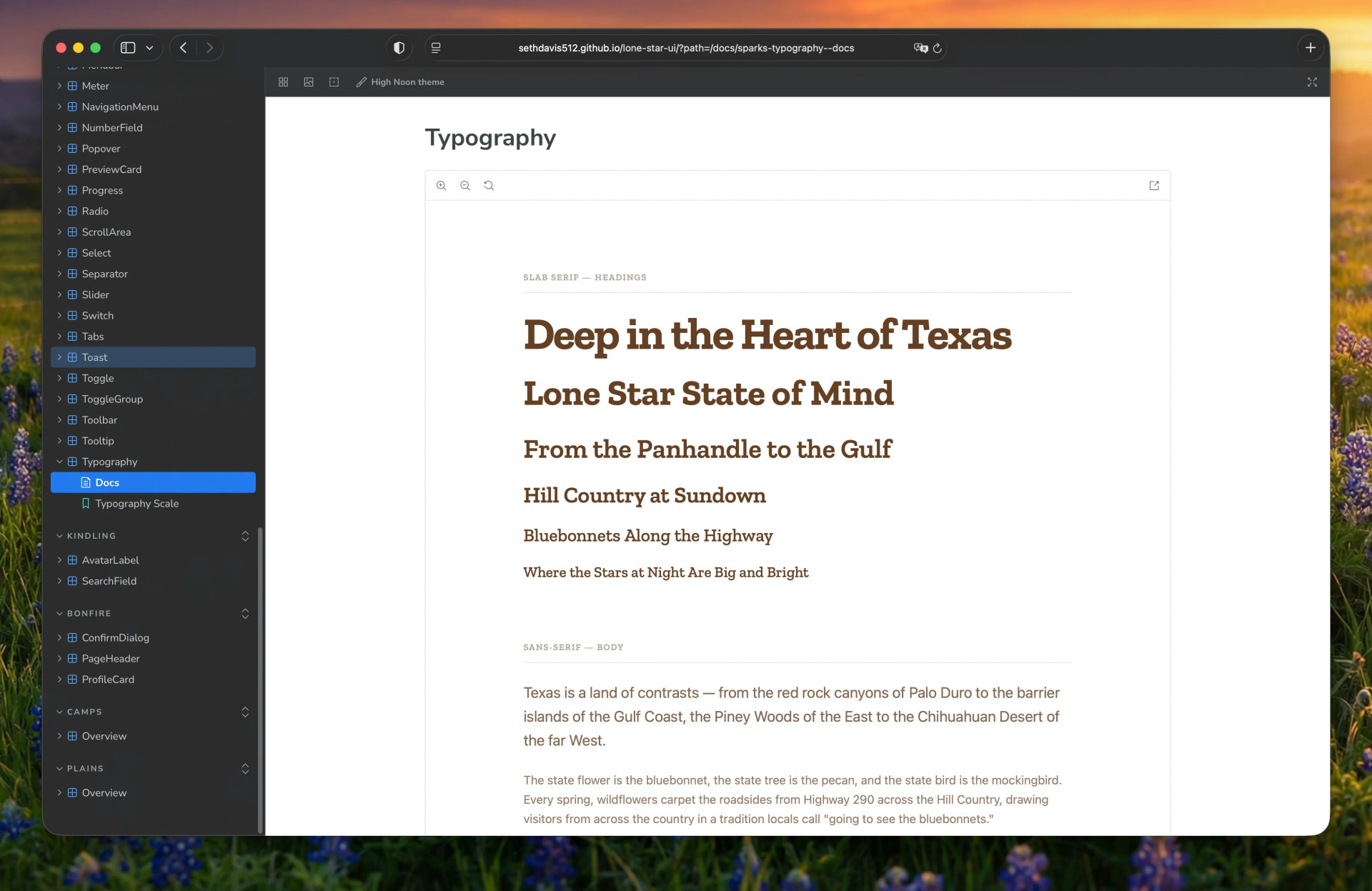
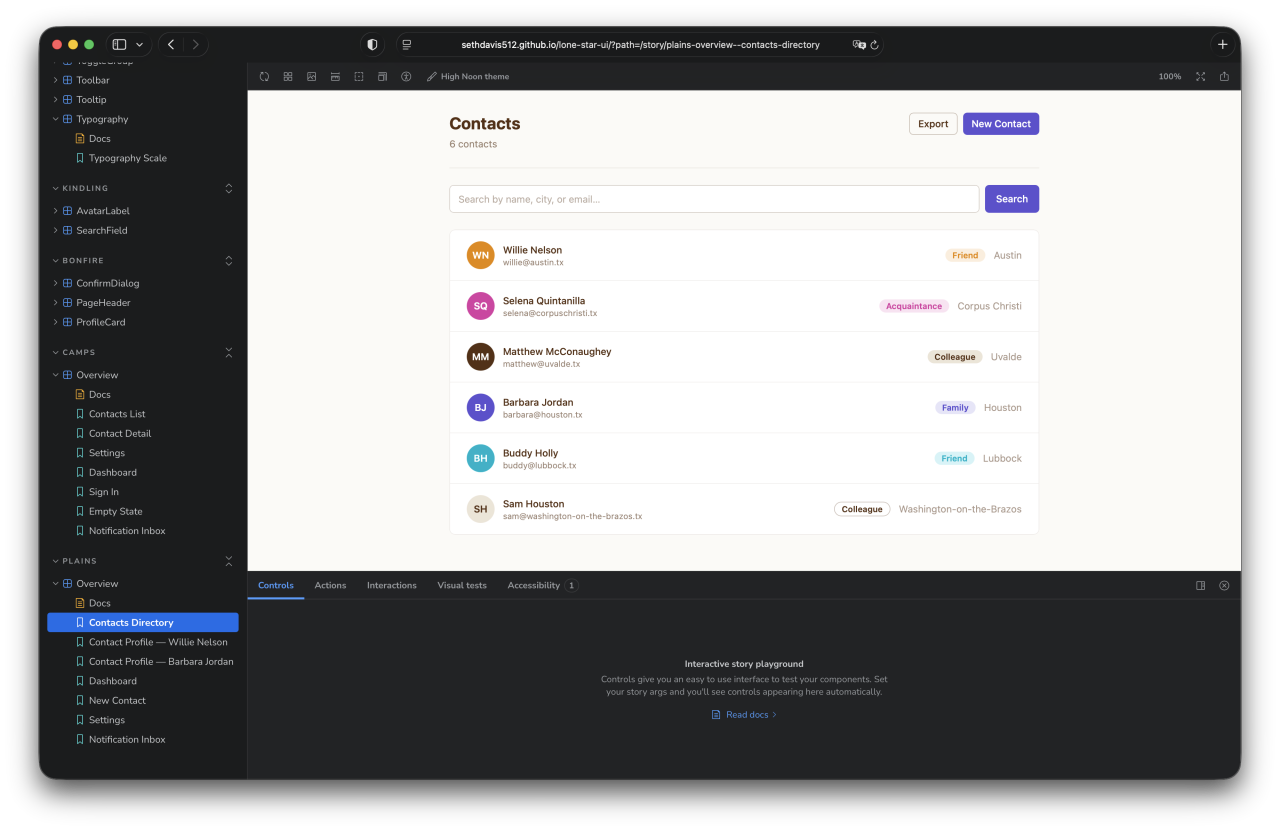
A published React component library with a Texas-inspired palette and over 40 accessible components. This site is built on it.
design system · react · storybook · npm
The challenge
Every new project used to start by rebuilding the same buttons, inputs, and dialogs, each time a little different. That's slow, and it lets a brand drift from page to page.
The approach
I built a component library once and published it to npm. Inspired by Allan Peters' Austin rebrand, it pairs a Texas palette with accessible components built on Base UI. Colors are defined as tokens in OKLCH with light and dark values, and every component is documented in Storybook, most with interactive tests.
The outcome
Lone Star UI now powers real sites, including the one you're reading. Swapping its color tokens gives a completely different brand without touching a single component.
What was delivered
- 40+ accessible React components
- OKLCH design tokens, light and dark
- Storybook documentation
- Published npm package
For your project
If your team keeps rebuilding the same UI, or your product looks slightly different on every screen, a design system like this gives you one source of truth your developers can install and your designers can trust.
Start a projectScreens

Next project
Ranch Road Brewing Co.
A website for a Hill Country taproom that the staff run themselves: change the tap list, post an event, or build a new page, and the site keeps up.